Project Background
Objectives
The scope of this fictitious project scope was to integrate a new feature to an existing product. 8fit was used as an excercise for how to work within an existing brand. The feature aims to help users incorporate healthy habits into their daily routines and stick to it.
Role
User Research, UX and UI Design
Timeline
80 h
Empathize
Market Trends, Competitor Analysis, User Interviews
The health, fitness, and wellness economy is widespread. In 2019 the Global Wellness Institute estimated the healthy eating, nutrition, and weight loss market at $702 billion. To gain insights into the industry, I started the project with market research and analyzed possible competitors.
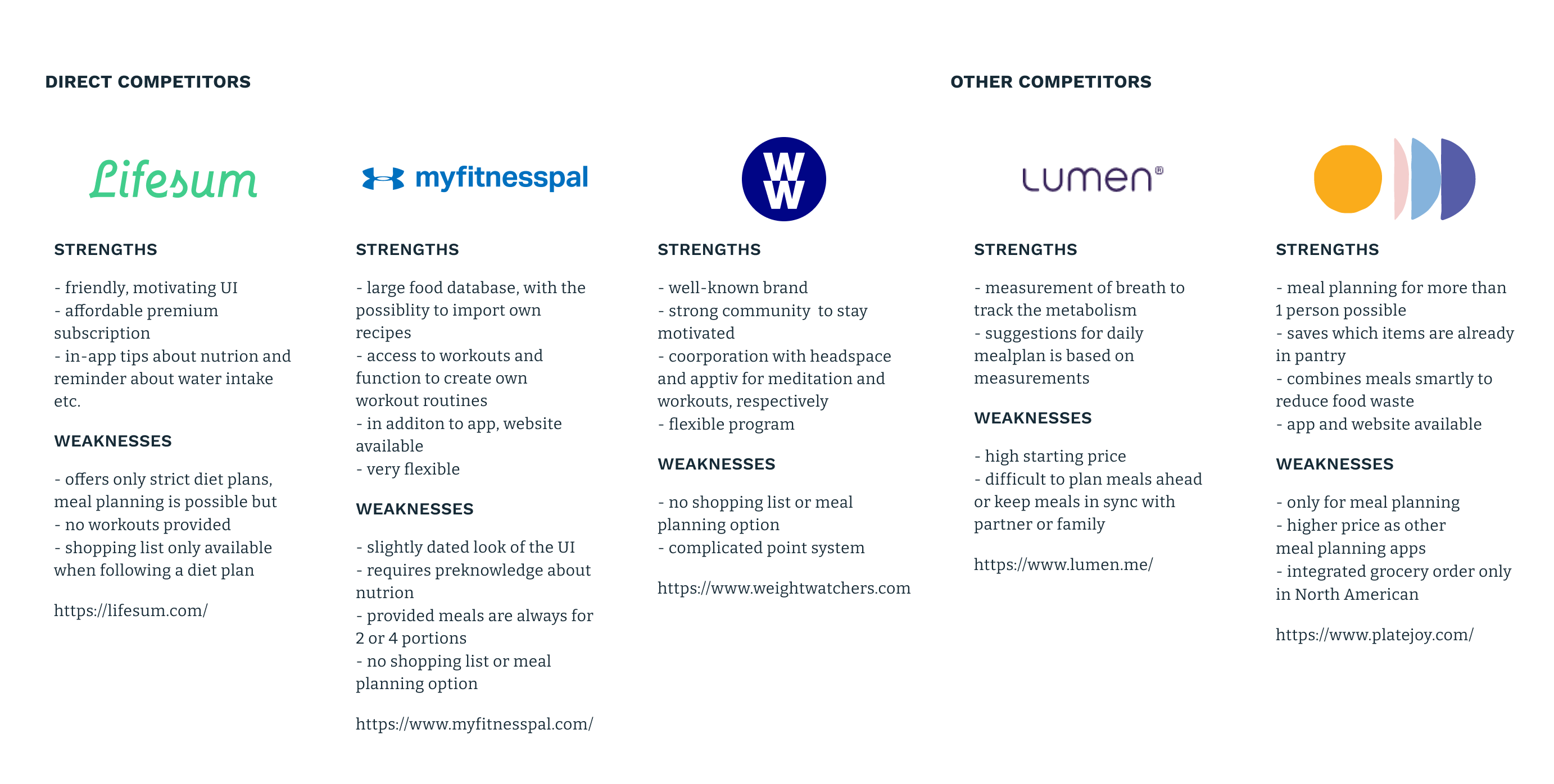
To get a clearer picture of the functionality and features of 8fit as well as the competitors, I created a feature matrix.
| 8fit | Lifesum | Myfitnesspal | WW | Lumen | Platejoy | |
| Meal tracking |

|
|
|
|

|
|
| Calorie intake tracking |
|
|
|
1
|
|
|
| Macronutrients tracking |
|
|
|
|
|
|
| Recipes |
|
|
|
|
|
|
| Meal planning |
|
 2,3 2,3
|
3
|
|
|
|
| Customized meals (portion size, etc.) |
|
|
|
|
4
|
|
| Shopping lists |
|
2
|
|
|
|
|
| Activity tracking |
|
|
|
|
5
|
|
| Workouts |
|
|
|
|
|
|
| Meditation & mindfulness training |
|
|
|
|
|
|
1 WW tracks not calories but uses a point system which
give each food item a certain amount of points
2 Predefined meal plans are available and come with a
shopping list
3 Recipes can be saved and used for meal tracking, meal
tracking feature can be used for planning as in Lifesum
4 Recipe suggestions are daily provided
5 Activities are tracked indirectly, before and after
each workout the devices is used to measure the breath, these
measurement point are named
I followed up with user interviews. To gain more knowledge, I talked with four users of health and wellness apps, two of which use 8fit. Their motivation, needs, and frustrations they are facing was of particular interest to me to find opportunities to improve the current 8fit experience.
Insights
- most users work towards a goal but are not willing to give up on tasty food since it is essential for a balanced life
- apps help to make eating habits better visible and form new ones
- users plan their meals mostly before visiting the grocery store
- everyday meals need to be quick and easy to prepare
Needs
- effortless ways to track/ plan meals
- tasty recipes that are quickly prepared and need a reasonable amount of ingredients
- reminder and incentives to stay on track
Pain Points
- to reconcile reaching a weight/fitness goal with cooking for a family or partner is difficult
- leftover ingredients and resulting food waste is a problem
Define
How Might We, Personas, Golden Path
Within every problem lies an opportunity. I used the gained insights as a starting point for a How Might We exercise. As a first step, I framed the problem space in more detail. I have followed by generating as many "How might we"-questions as possible. Then I picked three of these questions and thought about possible solutions.
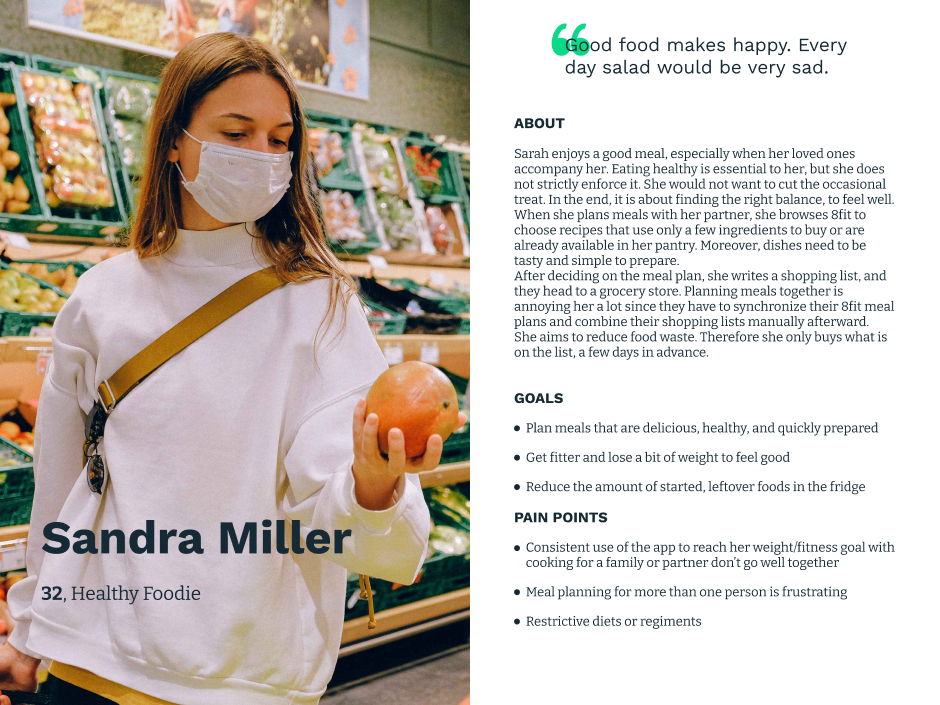
It is essential to know whom you design for. The seemingly best idea might be a waste if it does not fulfill your user's needs. Therefore I created a persona based on the user interviews - Sandra Miller.
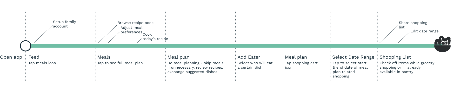
With the persona and the outcome of the HMW session at hand, I defined the Key User Journey. The so-called Golden Path illustrates the ideal user flow through a product. It focuses only on the primary path through a product. This helps to stay concentrated on the relevant parts of an already existing product. See the detailed Golden Path
Ideate
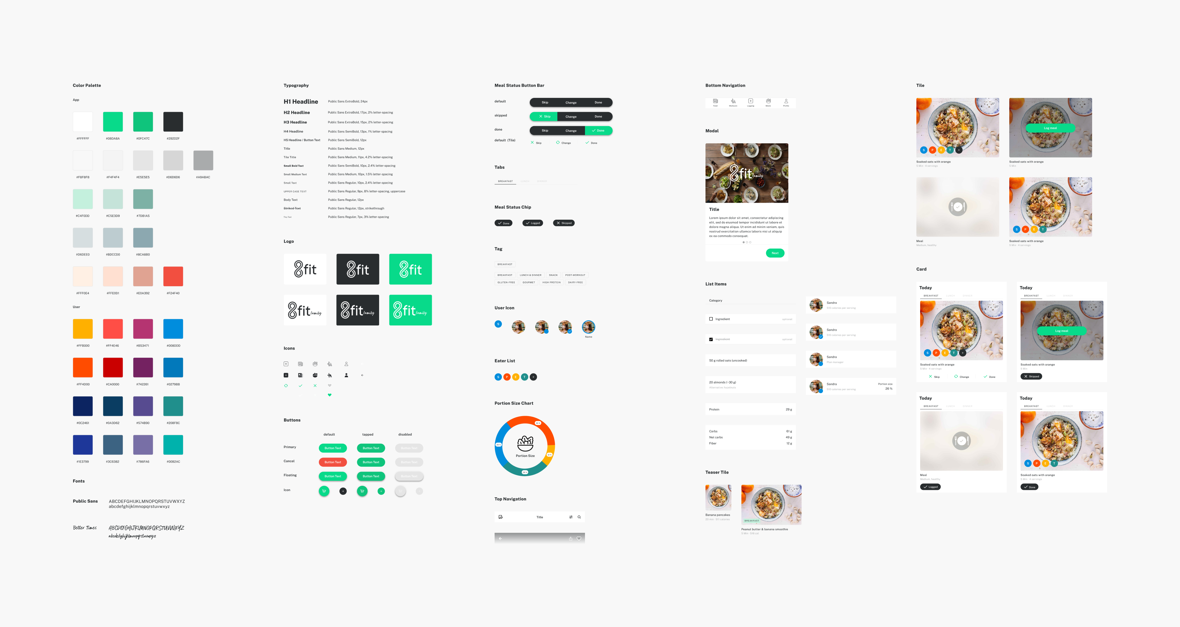
Wireframes, UI Design, UI Kit
In the next step, I created
wireframes
to integrate the new feature into the structure of the available
app. I started with reproducing the current app design and afterward
modified the screens. My goal was to integrate the new family
feature with a minimum of modification in the UI. Seemingly small
changes can have a significant impact on a product.
Since development teams are often very busy, I aimed to incorporate
components already in use. I introduced as few as possible new
elements to reduce the effort for developers and keep the design
system tidy.
Apart from that, I attempted to integrate the feature
seamlessly into the existing user flow. The fact one is part of a
family account should not significantly change how the food planning
works.
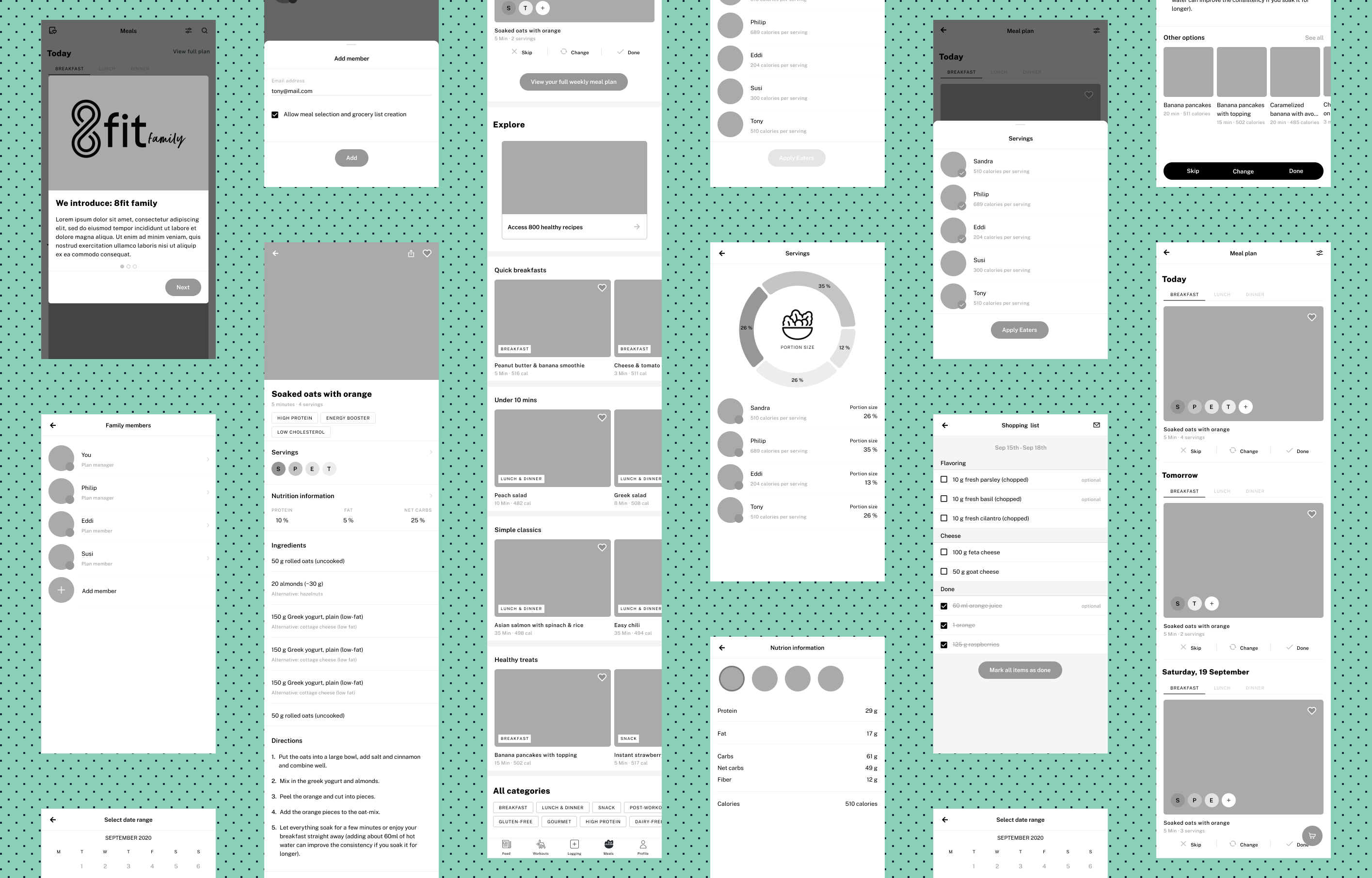
Afterward, I created the UI design. Here I paid attention to
maintain 8fit's visual language. For the onboarding screens, I chose
images that go well with the existing food imagery.
To make it easier for the users to identify which family member is
eating a particular meal, I decided to use recurring colors. In
combination with the user's initial and profile picture, the colors
serve to quickly recognize family members.
The UI Kit summarizes all used components and styles. It holds a combination of pre-existing design elements that I extracted from the app and newly created components. See the detailed UI Kit
Deliver
Prototype
UI designs can only implicitly communicate the way users interact with a product. Prototypes can help to make the implicit explicit. This helps in coorporation with stakeholders and developers alike. Therefore, I create a prototype.
Iterate
User Testing, UI Design & Prototype Iteration
Eventually, I used the prototype to conduct a usability test. I ran the test remotely, containing three tasks to solve for the participants.
- Setup process: add a family member.
- Meal planning: plan your meals for Saturday, add all family members that join the meals.
- Portion sizing: find how big a portion each person gets from the soaked oats with orange.
Overall most users were satisfied with the feature and its
integration into the 8fit app (on average 3.9 on a scale from 0 to
5). Interestingly, the test participants with lower satisfaction
were not 8fit users. One of them described the user flow as not
intuitive, although he directly solved all three tasks with one of
the lowest percentages of misclicks.
I used a Feedback Grid to gather and organize the user feedback.
With the feedback ready, I iterated over the UI design and improved the prototype. See the updated prototype here