Project Background
Objectives
The goal of this project was the creation of a new modern and fresh logo for the company, as well as a responsive eCommerce website that is pleasing to use and allows customers to browse through all products and to easily filter by relevant data.
Role
User Research, UX and UI Design
Timeline
8 weeks
Empathize
Market Trends, Competitor Analysis, User Interviews
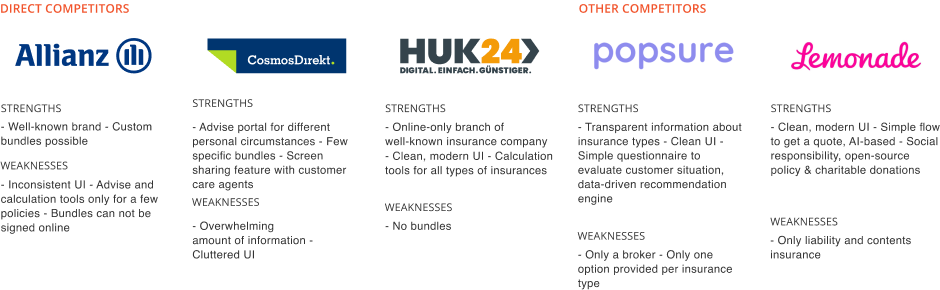
At the beginning of the project, I investigated the topic of insurance to learn more about this field and current trends. My findings help me to analyze competitors.
To gather insights about the user, I conducted user interviews with
four participants. The participants were between 28 and 58 years
old. Two of them were male, two female. One of the participants was
pregnant; one has a child. All four participants purchased insurance
at least one time online.
During the interviews, it was possible to observe general goals of
potential users, also shared needs and pain points were apparent.
Goals
- Get appropriate policy conditions which include low costs and excellent benefits
- Uncomplicated handling of insurance-related tasks from application to reporting a claim
Needs
- Transparent, clearly understandable information
- Hassle-free contact to customer service representatives at any time
- Settling of claims in a forthcoming and timely manner
- Creation of a trusting relationship
Pain Points
- Small print and hidden information
- The process of comparing policies is time-consuming and complicated
- Feeling pressured to commit to early to an insurance quote without having enough knowledge and understanding
- Bureaucracy and the need to handle a lot of paperwork
Define
Personas, Sitemap, User Flow
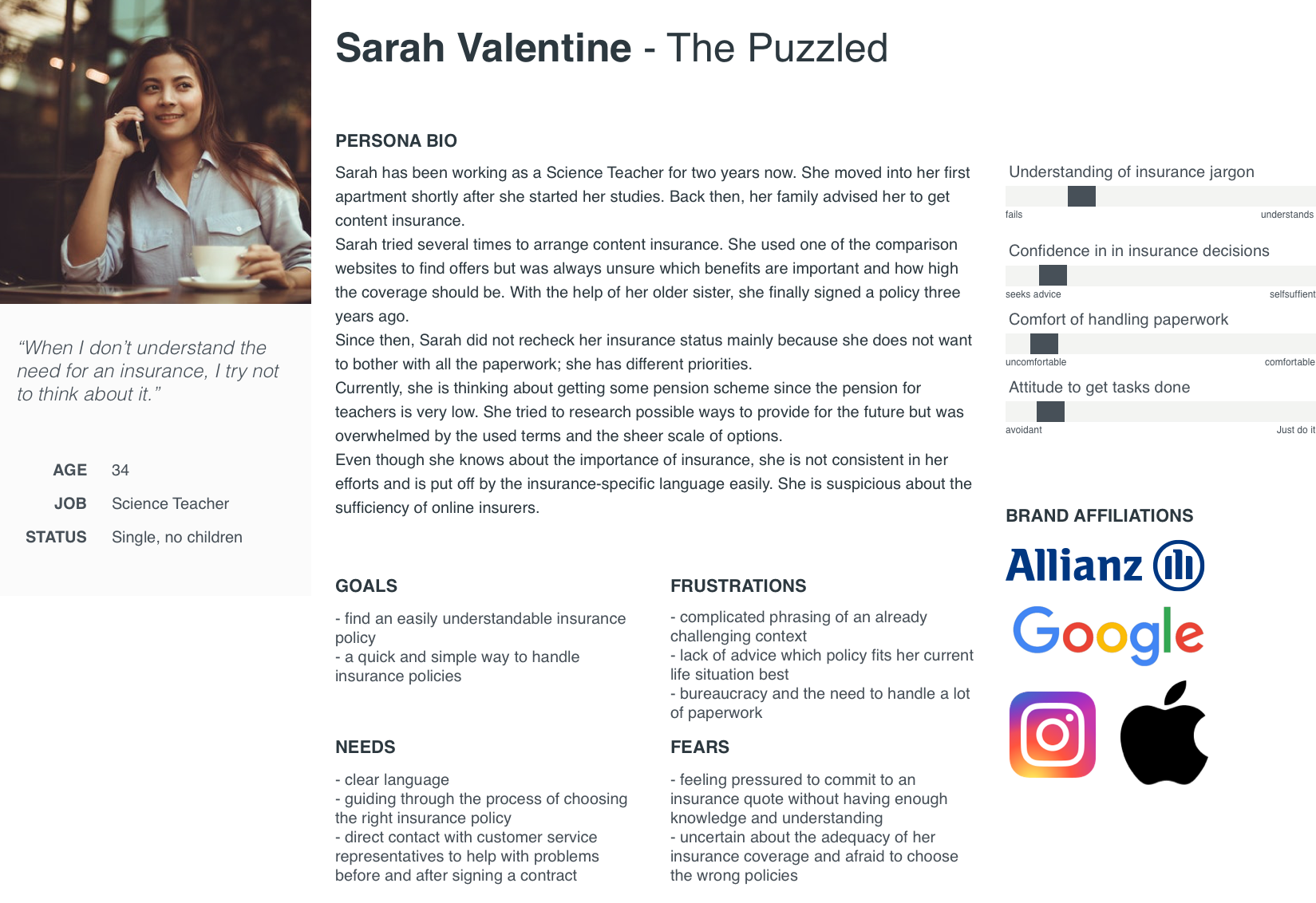
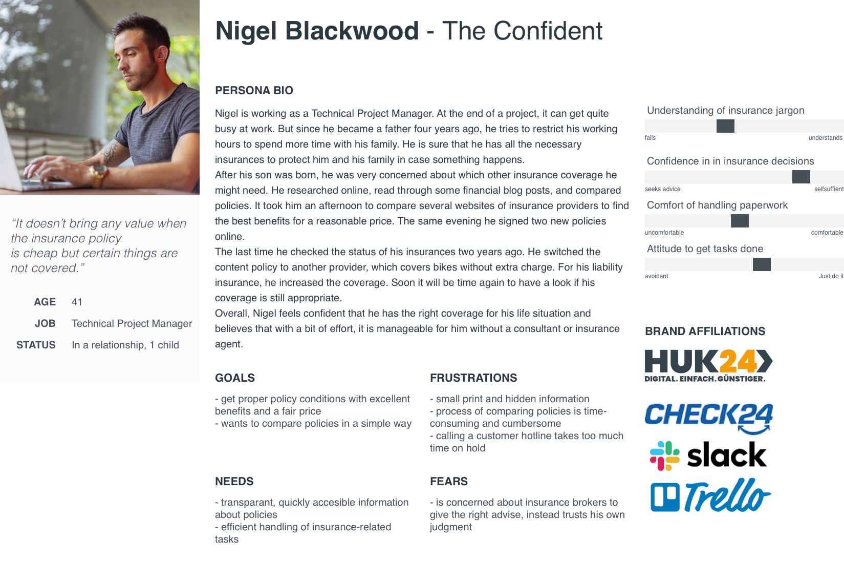
With the user interviews at hand, I clustered the gathered information to find patterns. Based on these patterns, I created two personas - Sarah Valentine and Nigel Blackwood.
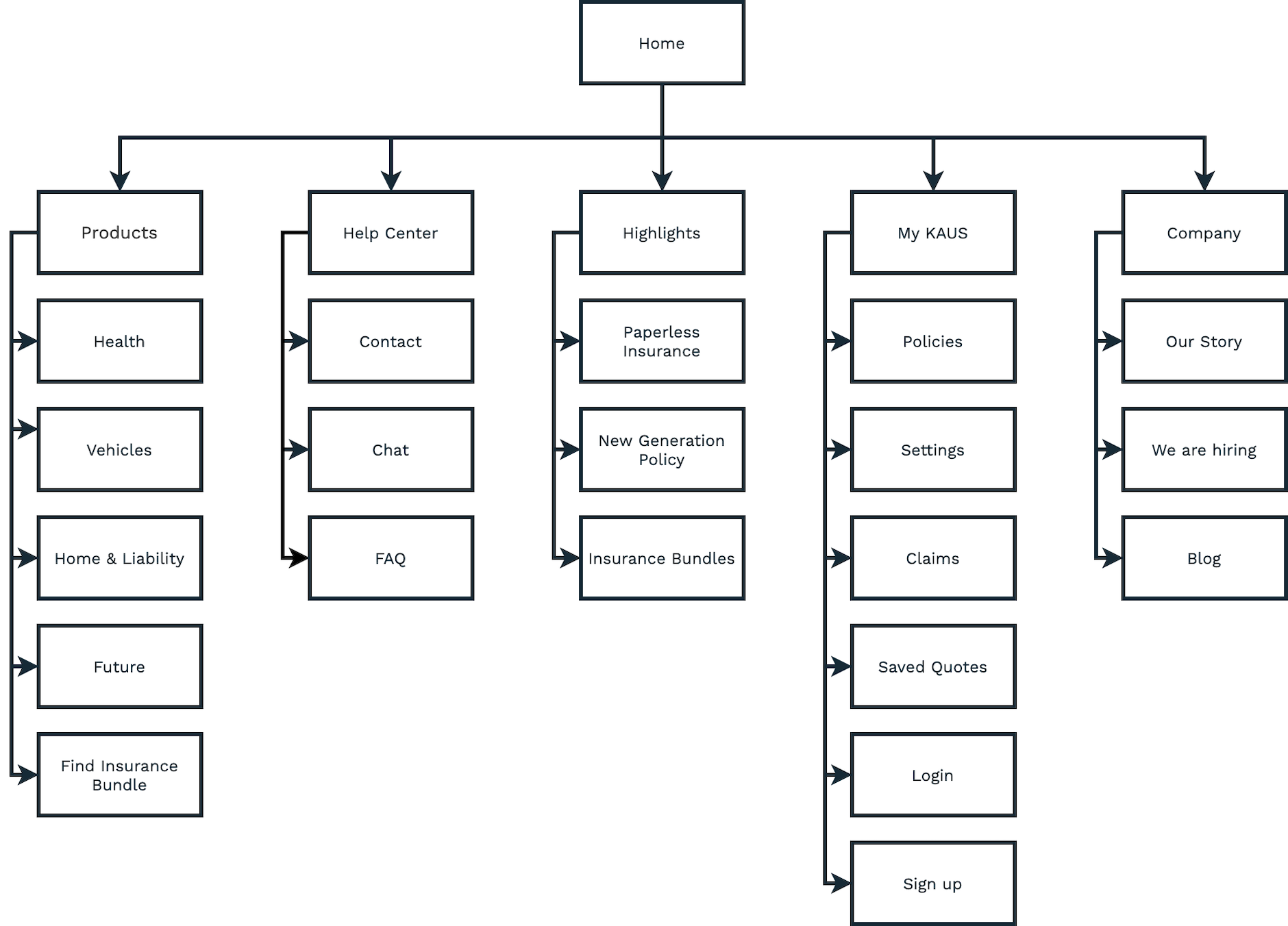
Sitemaps define the hierarchical structure of a website. To help users find what they are looking for, I conducted an open Card Sorting exercise. While most of the participants clustered all insurances together, it was interesting to see that the other had a distinct way to organize the insurances. Keeping this in mind helped me to arrange the super-category "Insurances".
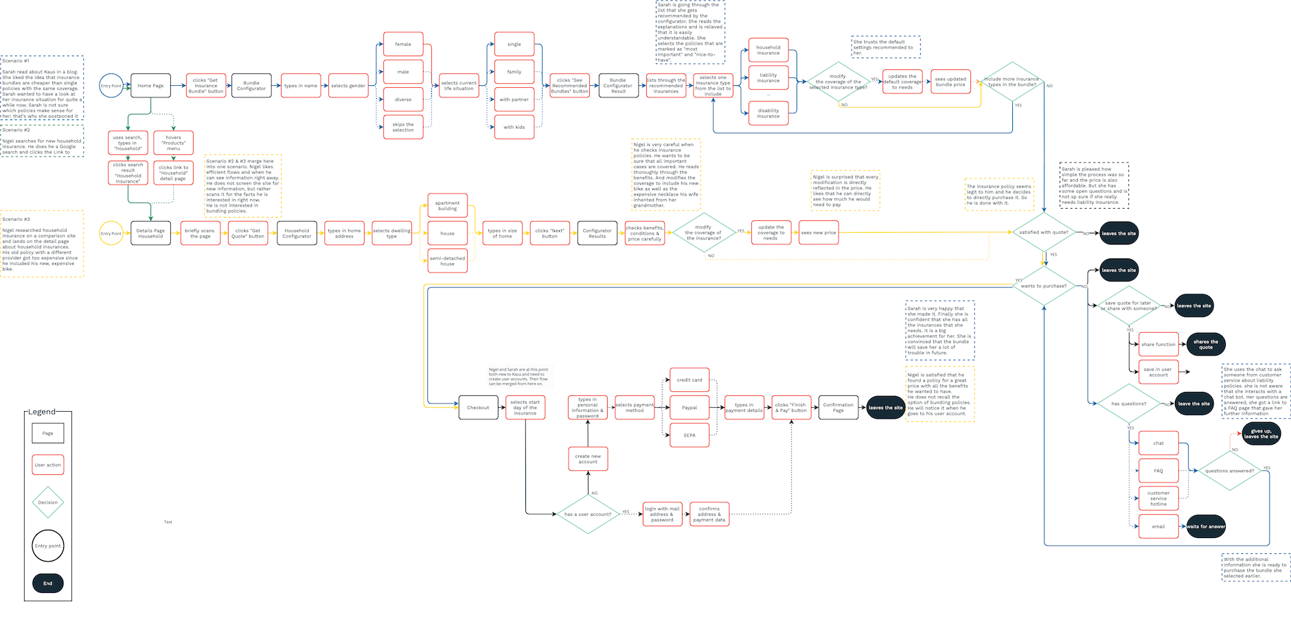
I sketched the user flows for the personas Sarah and Nigel. Their goal is to find and purchase insurance. The user flow specifies the user's path through the website to achieve this goal. See the detailed user flow
Ideate
Sketches, Wireframes, Mood Board, Logo & Wordmark, Style Tile, Responsive UI Design
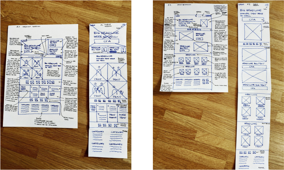
Sketching is a great way to explore different directions. I attempted to sketch several options, iterating on them before creating digital files.
I aimed to find ways to serve both personas' needs since the two are
quite distinct. For users like Sarah Valentine, I focussed on
finding a way to reassure and guide users through the insurance
selection and conclusion of an insurance contract. It appeared
essential to provide a seamless, explanatory experience for these
hesitant users to encourage and take pressure away from them.
On the other hand, users similar to Nigel search for an efficient
way to find necessary information. To serve these users well, I
concentrated on making prices and conditions easily accessible.
Since Nigel comes most likely from a search or price comparison
engine, the single product pages are significant for him. Whereas,
for Sarah, the overall experience is essential to obtain her
confidence in online insurance.
I referred to commonly used patterns to find solutions the user
would feel familiar with.
See all annotations in detail
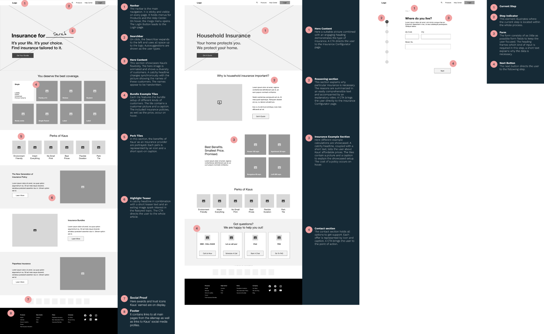
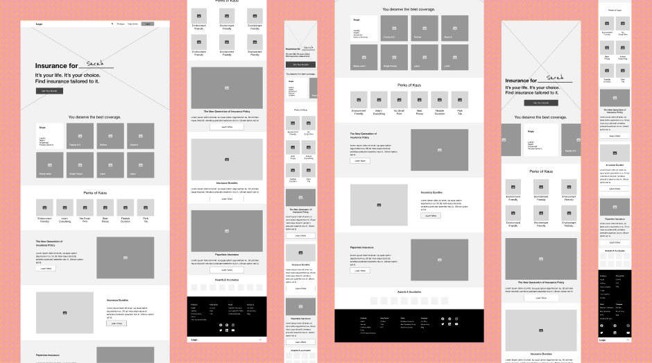
Additionally, I created wireframes for different viewports. Mobile traffic accounts for approximately half of the internet traffic worldwide. Therefore, it is crucial to keep mobile devices in mind when designing a website. See the wireframes for different viewports
After the wireframes were defined, I went on to the brand
attributes. Kaus stands for innovative, friendly, honest,
dependable, affordable insurance. Insurance for everyone.
Many insurance providers on the market intend to emphasize how
trustworthy and dependable they are. Often, it is done with a
distinctly calm blue color schema. < br/> For Kaus, I aimed to go
off the beaten paths, away from other insurance companies' commonly
used color palettes, to make Kaus stand out and highlight mainly how
innovative and friendly they are. I first gathered ideas on a
mood board
and explored different directions. Eventually, I created two
different color palettes
Logo and wordmark strive to make a brand unique and recognizable. With the brand's attributes in mind, I created a fun logo with a slight retro feel. It suggests years of experience in the insurance market and presents Kaus as a competent yet friendly insurer.
To get deeper into the branding as a whole, I created
Style Tiles
for both color palettes, exploring how the website's look and feel
could be.
Eventually, I decided on the first color palette with yellow and
orange to stand out from the typical color palettes and the
complimentary blue colors to present Kaus as trustworthy and
dependable.
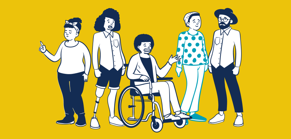
Kaus is supposed to be insurance for everyone. Therefore it appeared
fundamental to depict a range of diverse people to transport this
thought. I had the idea to use illustrations solely instead of
photos to create a modern feel. Additionally, I aimed for inclusive
depictions to give everyone the chance to identify with Kaus, to see
themself represented.
With
Open Peeps
created by Pablo Stanley, I found an illustration library that
helped me achieve this aim.
Lastly, I combined the wireframes with the envisioned branding and UI elements to create a responsive website design.
Deliver
UI Kit, Prototype
UI Kits are a great way to document used UI elements in one place, f.e. to give stakeholders a better overview, communicate components' styling to developers, and as well serve as a base for a design system. See the detailed UI Kit
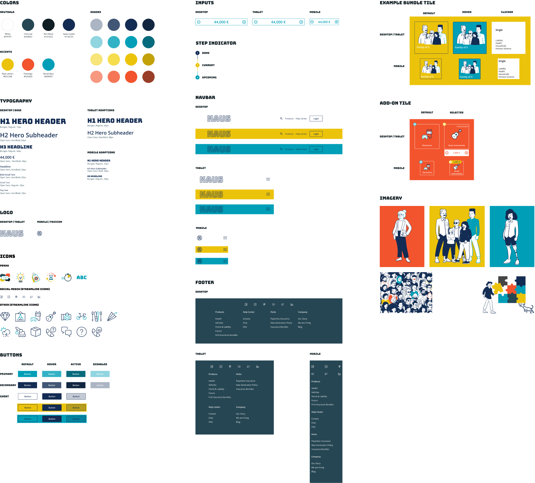
Prototypes go even further and serve to show how a product interacts with a user. This can be on a small scale to show a particular interaction pattern or a higher level to demonstrate and evaluate user flows. Based on the website designs and wireframes, I created an interactive prototype for desktop. See the prototype here
Iterate
User Testing, Second UI Design Iteration
I used the prototype to conduct user tests. My goal was to discover aspects of the site that might cause confusion, uncertainty or frustration to the user. It was important for me to test if the design builds trust and feels assuring enough to the user. Additionally, I wanted to evaluate the overall concept.
To generate insights, I created an affinity map to group the outcome of the different interviews into related topics.
The tests showed that the overall flow is clear since all participants were able to finish the assignment. The study revealed several places for improvements:
- the amount of information provided can be improved (all participants mentioned that more details would be beneficial for a better understanding)
- the structure of the Insurance Quote page and how bundle prices are displayed
- the Bundle Example Tiles were well-received, but all participants expressed the wish for additional ways to interact with it
With the user feedback at hand, I iterated over the UI design and updated the prototype. See the updated prototype