Project Background
Objectives
The goal of this conceptual project was to design an application from scratch.
Role
User Research, UX and UI Design
Timeline
80 h
Empathize
User Survey, Market Trends, Competitor Analysis, User Interviews
To gain more insights into which tools hikers use to prepare for a trip, I started off with a small survey.
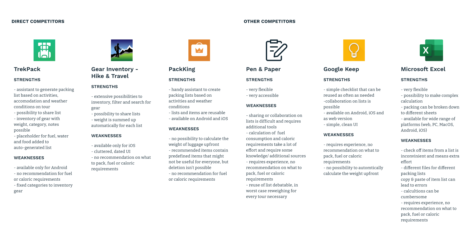
Afterward, I researched possible competitors and had a look at current trends in the outdoor market.
With the previous results at hand, I conducted user interviews with four keen hobby hikers. All of which with several tours of varying conditions over the past years. For me, it was especially interesting to hear about the way they approach an upcoming tour. How do they decide what to pack, and what are their challenges to deepen my understanding. I clustered their answers in an affinity diagram. See the detailed affinity map
What became evident during the interviews is that packing lists are only used for longer tours to remember everything. Weight plays here in most cases an important role since hikers have to carry all their gear. When changeable conditions can be expected on the trail and particular circumstances on trails make it necessary to pack more and get prepared better, it poses the biggest challenge to the interviewees. One part of this is due to unawareness of how to determine f.e. fuel requirements or the right amount of food to pack. Another one is that the research for information can be cumbersome. Especially, since the amount of food is very individual to the hiker. Even though all of the interviewed hikers did already several tours, most would not trust their own judgement and rather pack more supplies.
Define
Personas, Emotional Journey, Sitemap, User Flow
Proceeding from the user interviews, I defined the primary persona – Martin Smith.
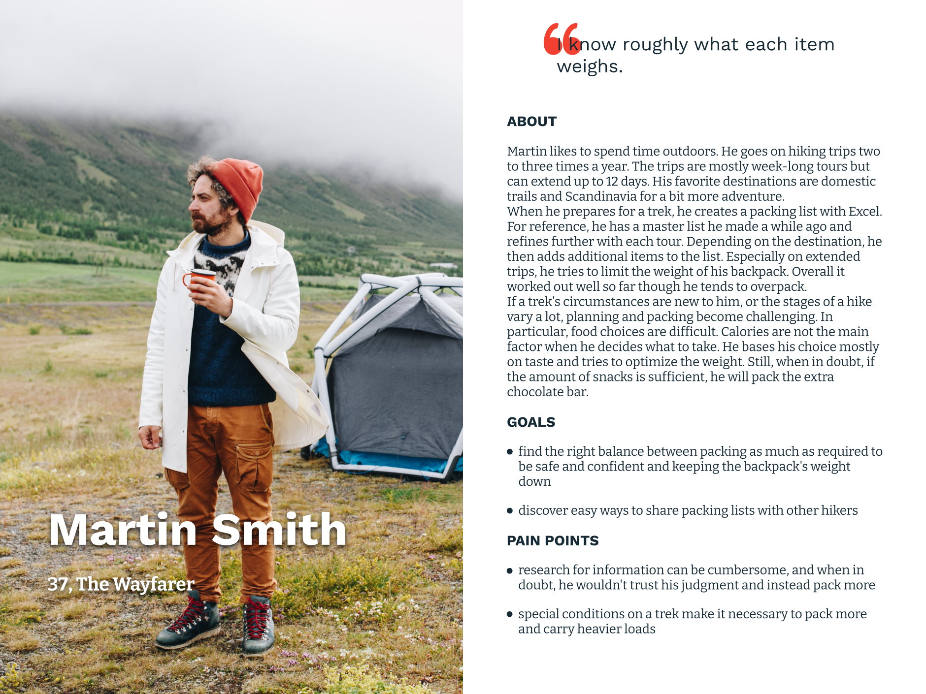
A typical tour would lead Martin on a trail through Scandinavia. To
prepare for a trip, he creates a packing list with Excel.
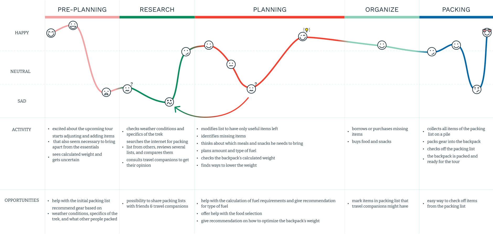
A closer look at Martin's emotional journey reveals where
opportunities lie and how his whole tour preparation can be
improved. Following his planning and packing it becomes clear that
Excel even though great at calculating weights does not have
features to consult other hiker’s packing lists, share one’s current
list with travel companions nor recommendations on how to optimize
the pack.
See the current emotional journey in detail
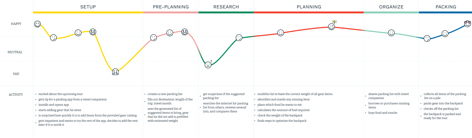
With these opportunities in mind, I defined an ideal emotional journey for the app's first use. See the ideal first use in detail
In the next step, I conducted an open Card Sorting. This exercise helped me organize the sitemap to reflect how the users think about content.
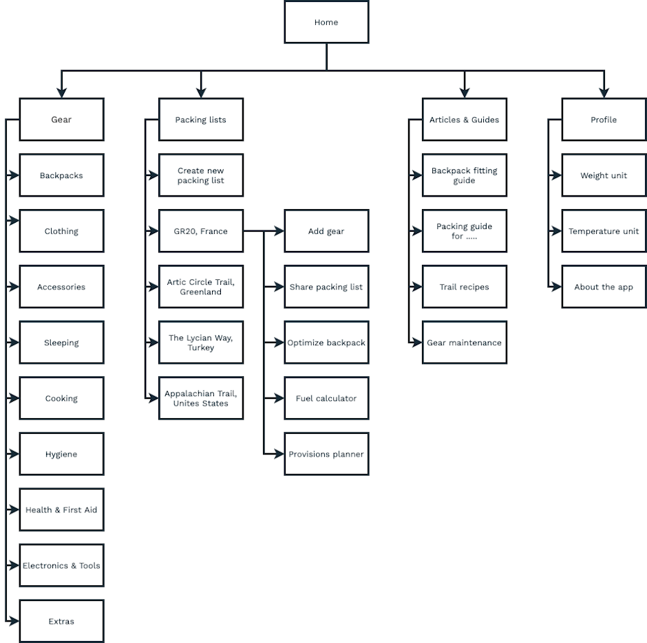
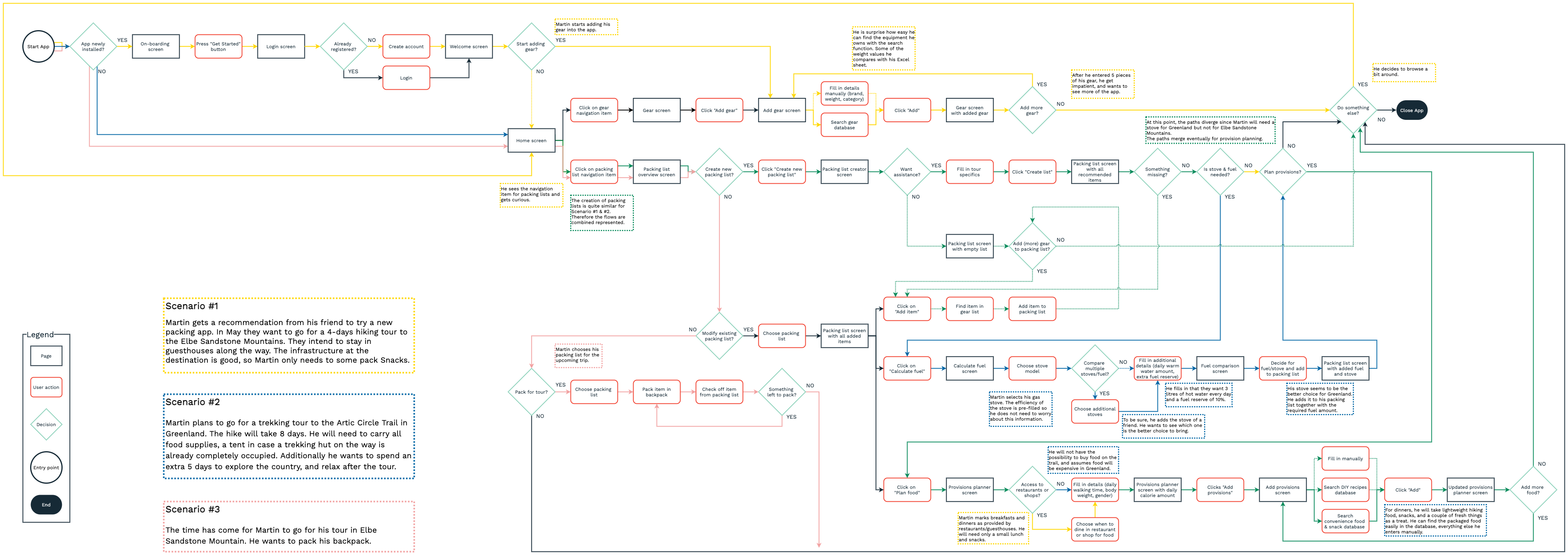
With Information Architecture and ideal emotional journey defined, I determined the user flow in the next step. I paid attention on three possible scenarios that are likely for Martin — planning of a short trip, preparations for a trekking tour where all supplies need to be brought, and the actual packing for a trip. See the detailed user flow
Ideate
Wireframes, Mood Board, Logo & Wordmark, Style Tile, Responsive UI Design
Based on the user flow, I then identified the key-screens and created wireframes.
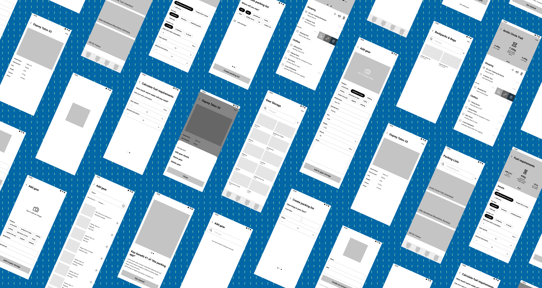
Wireframes are used to set the basic structure before any interface
design or content is added. Accordingly, it is much simpler to
adjust when issues become evident.
Thus, I created two low
fidelity prototypes to evaluate the user flow. I conducted a
moderated usability test in a remote setup. The participants were
given a scenario where they plan to go to Greenland on the Arctic
Circle Trail and were recommended roofoss from a travel buddy. They
were asked to fulfill the following tasks:
- add your gear to the app (prototype 1)
- create a packing list (prototype 2)
- create a food plan and add provisions for the first dinner>
- calculate the required amount of fuel
While the overall user flow worked as intended, and all participants could complete the given tasks, the test revealed areas for improvement. I collected all user feedback in a Feedback Grid to conclude the next steps.
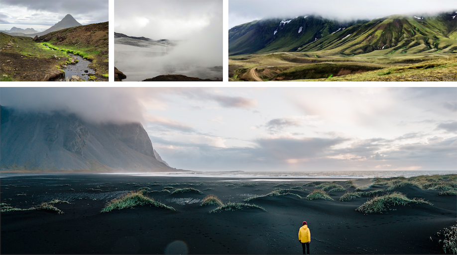
After I iterated over the wireframes, I focussed on the branding. I started with gathering inspirations on a mood board. Icelandic landscapes inspire the color palette. It aims to cater to the brand message "be curious, be adventurous, be honest, and be dependable". To dive deeper into the look and feel of the app, I created a Style Tile.
The name roofoss is derived from the combination of (kanga)roo, which always has its pouch (or may I say pack) with it, and foss, the Icelandic word for waterfall. Therefore, the logo features a stylized kangaroo.
Finally, I combined structure and visual design to create the user interface.
Deliver
UI Kit, Prototype
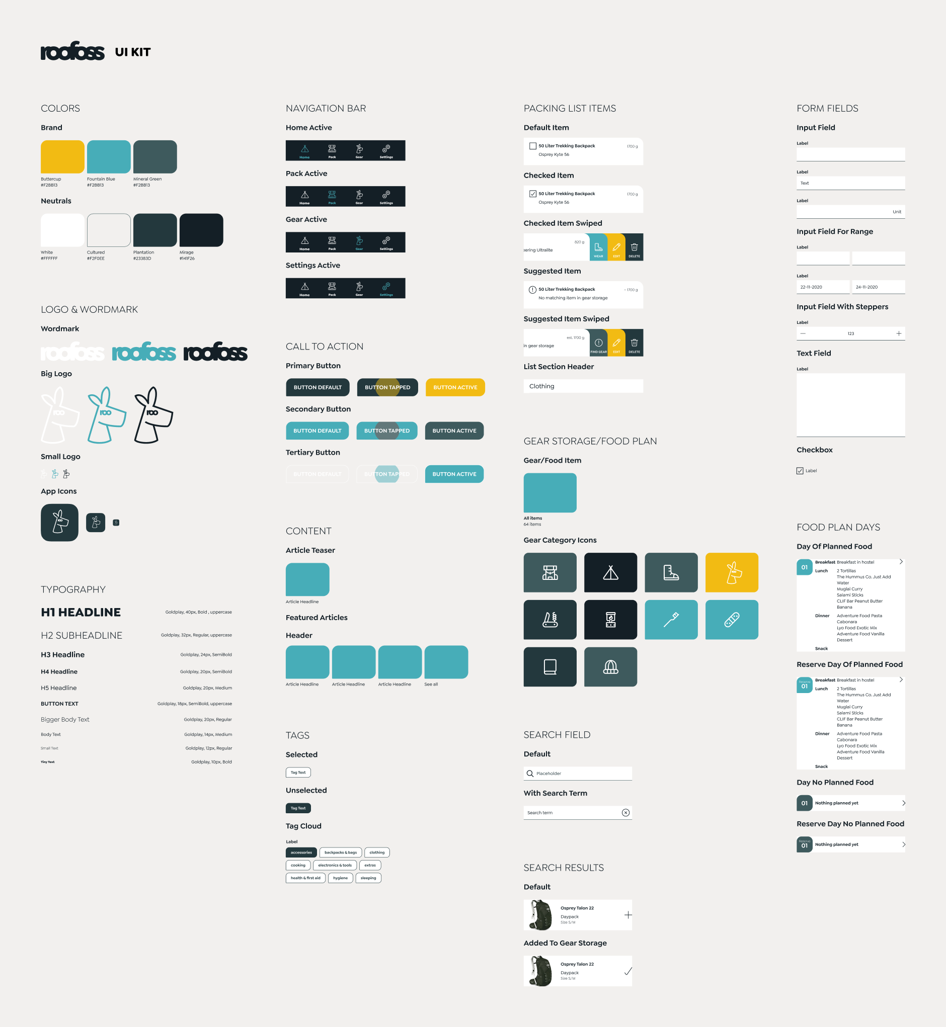
Within the UI Kit, I collected all used components. UI Kits are
great to present UI elements comprehensively.
See the detailed UI Kit
But since UI Kits fail to give details about how certain elements interact with the user, I also created a high-fidelity prototype.
Iterate
User Testing, Second UI Design Iteration
With the prototype at hand, I conducted a second round of user
tests. I modified the tasks from my first usability test to focus
more on adding gear and food. I wanted to evaluate if the user
experience improved compared to the last test cycle.
I clustered the user feedback in a Feedback Grid to be able to see
repeating patterns.
See the Feedback Grid in detail
The usability test revealed that even though the user flow works as intended, some details should be improved further.
- Compared to the last user test adding gear and food improved noticeably. Users were mostly satisfied with the simplified process. But user flow of the food plan can be further enhanced.
- The last user test showed that users had trouble understanding the given stats. The overall perception of the stats improved since the provided data was more coherent. But especially in the packing list, the given numbers weren’t clear to all participants.
- In the last test, participants were unsure which function the checkboxes had. Users realized now the packing list is generated for them. But the packing list items are an area to be improved.
- The biggest issue was the lack of buttons in forms. While most participants were surprised but quickly found a way to go through the form, the others got pretty confused.
Based on the feedback, I iterated over the UI design and updated the prototype. See the updated prototype